Gemini Legal

Transforming legal workflows through user-centered systematic design.

Transforming legal workflows through user-centered systematic design.

Context

Designed a scalable B2B Enterprise SaaS platform from concept to launch, serving solo practitioners to large law firms (500+ attorneys) and improving workflow efficiency.

Context

Designed a scalable B2B Enterprise SaaS platform from concept to launch, serving solo practitioners to large law firms (500+ attorneys) and improving workflow efficiency.

Context

Designed a scalable B2B Enterprise SaaS platform from concept to launch, serving solo practitioners to large law firms (500+ attorneys) and improving workflow efficiency.

Role & Team

As the sole Product Designer, I owned the end-to-end design process and collaborated closely with a PM, 4 engineers, a QA engineer, the marketing department, and legal professionals to bring the product from conception to launch.

Role & Team

As the sole Product Designer, I owned the end-to-end design process and collaborated closely with a PM, 4 engineers, a QA engineer, the marketing department, and legal professionals to bring the product from conception to launch.

Role & Team

As the sole Product Designer, I owned the end-to-end design process and collaborated closely with a PM, 4 engineers, a QA engineer, the marketing department, and legal professionals to bring the product from conception to launch.

The Challenge

Legal professionals juggle fragmented workflows across multiple platforms, often leading to inefficiencies, missed deadlines, and repetitive tasks.

The Solution

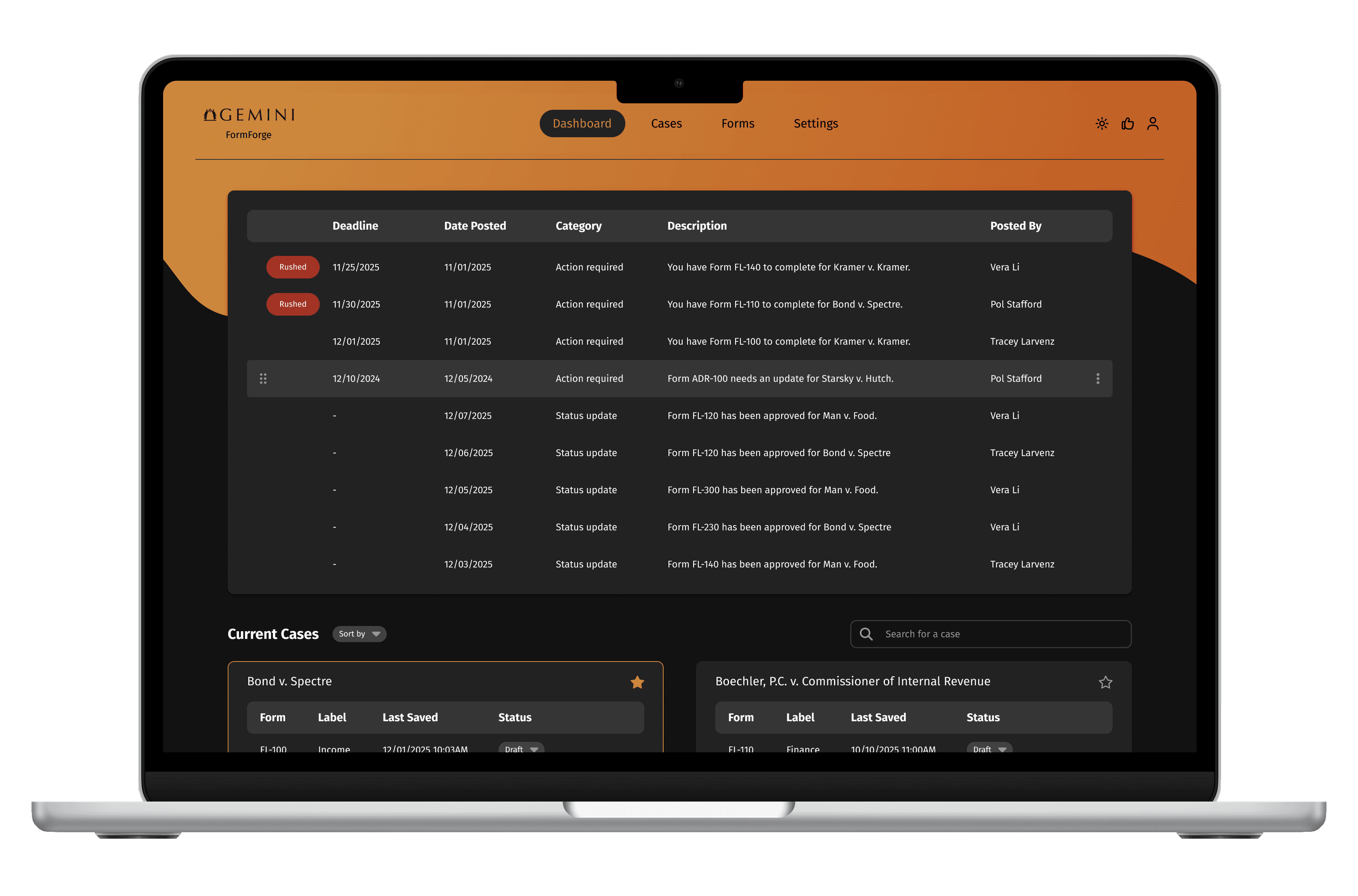
FormForge centralizes form preparation, filing, and case management. With platform integrations, proactive alerts, and customized dashboards, it streamlines tasks and reduces friction.

Impact

  • Time Savings: Reduced from 2+ hours to under 15 minutes for form completion (88% reduction).

  • Error Rate Reduction: Reduced data entry errors by 60% through clearer input hierarchy.

  • Workflow Efficiency: Users reported a 30% reduction in time spent on repetitive administrative tasks.

  • Task Success Rate: 92% of key workflows completed successfully by users on the first attempt.

Final Solution

Final Solution

Final Solution

01

UNIFIED WORKFLOW

01

UNIFIED WORKFLOW

Streamlined the entire form-filling process by consolidating form completion, team management, and court interactions into a single platform, eliminating the need for manual emails and external websites.

01

UNIFIED WORKFLOW

01

UNIFIED WORKFLOW

02

PREDICTIVE CONFIDENCE

02

PREDICTIVE CONFIDENCE

Created a confidence indicator for backend autofill data pulled from court websites, allowing users to quickly see how reliably the system matched information and decide whether verification or edits are needed.

Introduced a reusable template-group system that lets legal teams save common structures and repurpose them quickly across new forms.

03

REUSABLE TEMPLATE

03

REUSABLE TEMPLATE

04

SEAMLESS MODE SWITCHER

04

SEAMLESS MODE SWITCHER

Enabled effortless transitions between viewing, editing, and creating fields, allowing users to modify structures without breaking their flow.

05

SCALABLE PERMISSION CONTROL

05

SCALABLE PERMISSION CONTROL

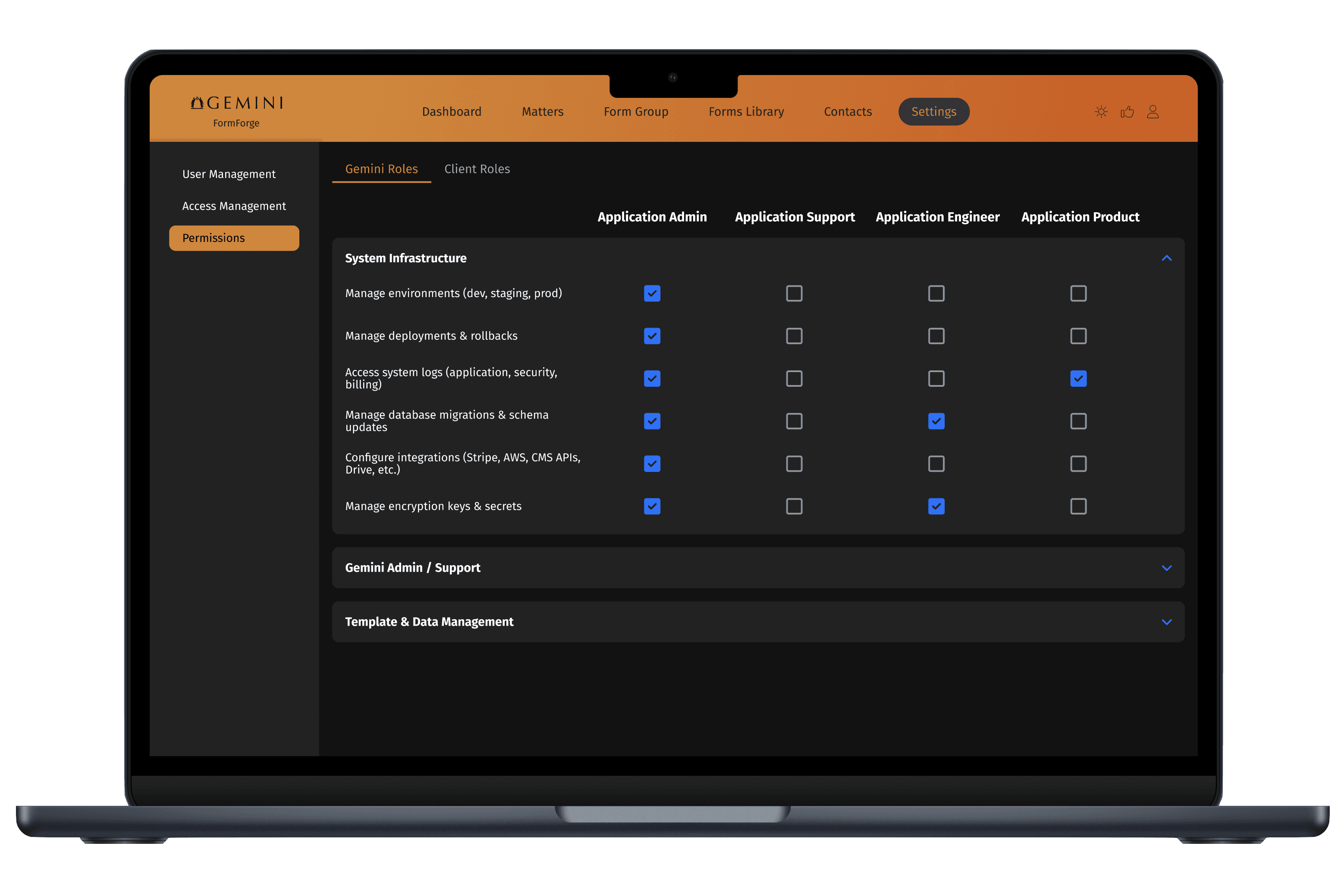
Implemented flexible permission settings tailored for firms of different sizes, ensuring secure access while supporting organizational complexity.

Design System & Implementation Support

Design System & Implementation Support

Design System & Implementation Support

I established a modular design system in Figma from the ground up, leveraging variables and token architecture to enable long-term scalability. Throughout development, I collaborated with engineers to implement components accurately and maintain cross-platform consistency.

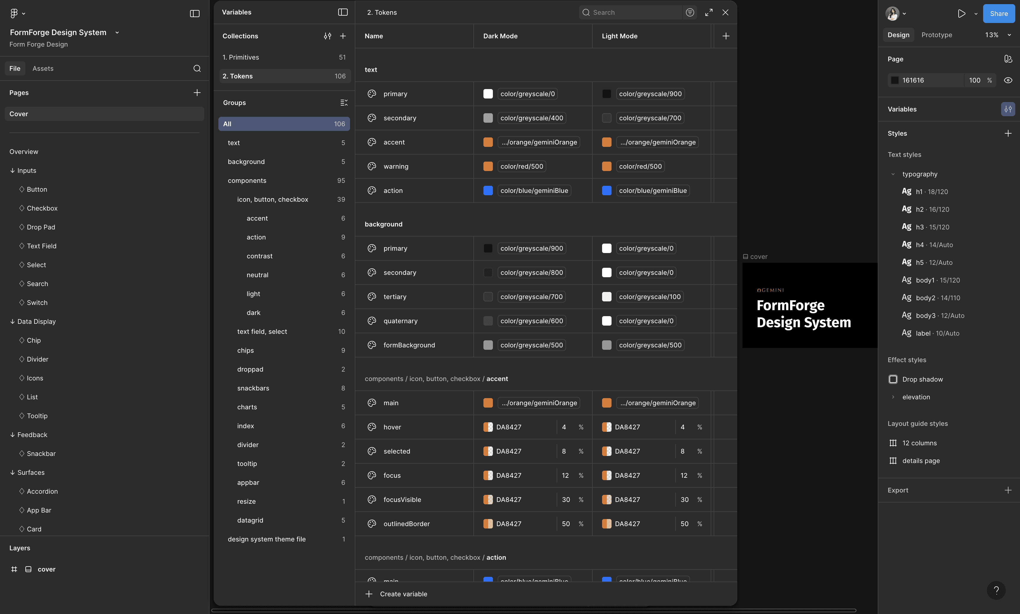
used Figma's variable modes to create themes systematically

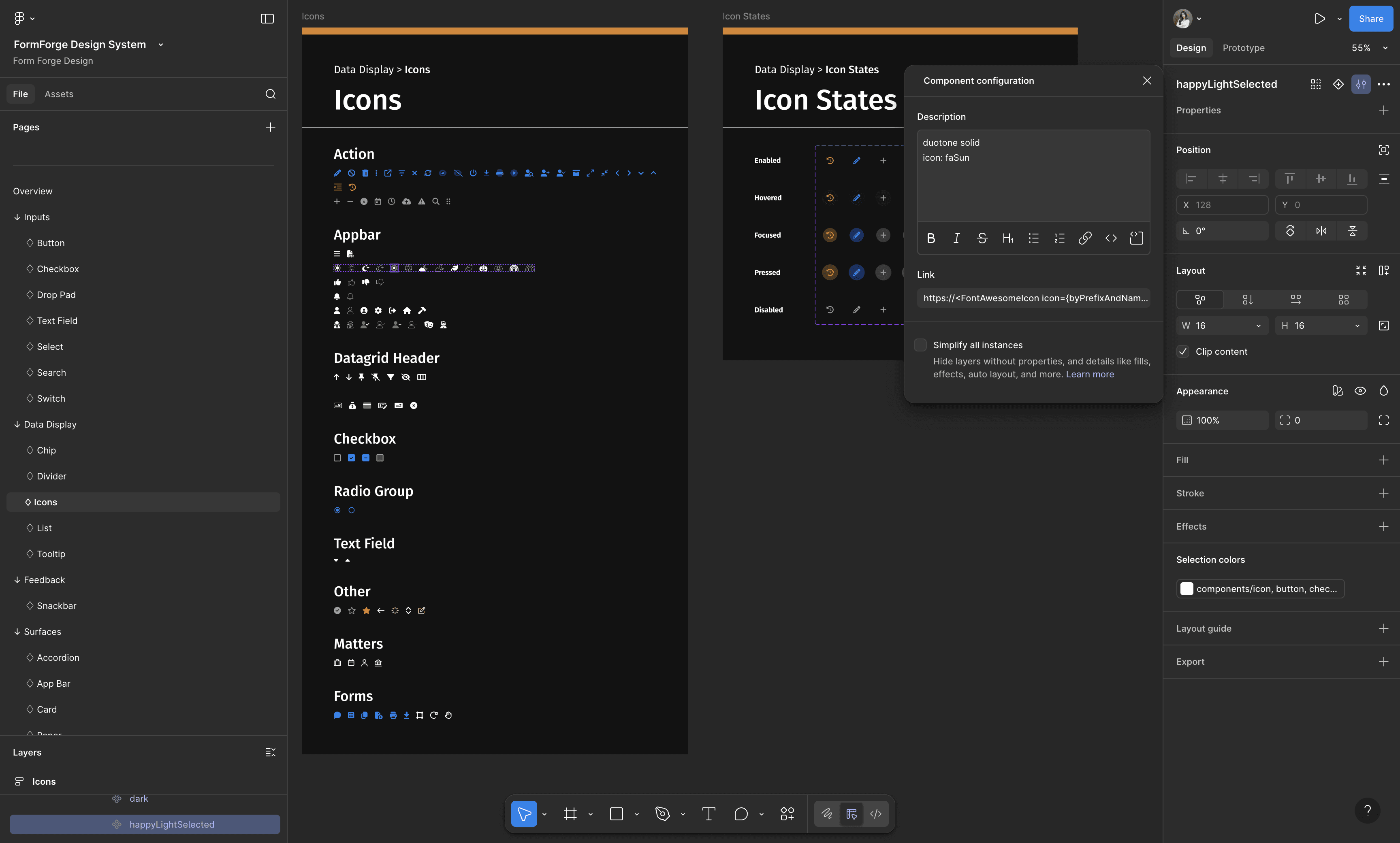
all icons map directly to their FontAwesome sources

QA-ed the code base to make sure the naming and values are implemented correctly

·

The Process

The Process

The Process

THE PROBLEM

Legal professionals spend hours manually filling court forms, leading to wasted time and errors.

USER RESEARCH

To solve this problem, I first conducted user research in several formats with legal professionals to deeply understand their workflows and identify key pain points.

CURRENT USER FLOW

At a high level, legal professionals are assigned cases, work through the required forms for each case, and submit completed forms to the court.

However, the current workflow is overly complex due to a fragmented platform. Legal professionals must manage cases through email, download forms from court websites or local files, manually complete and save them, and email them back to the appropriate recipients. This results in frequent errors, duplicated effort, time loss, and difficulty tracking deadlines.

NEW USER FLOW

To address these challenges, I designed a simplified, end-to-end workflow for FormForge that centralizes case notifications, automatically retrieves the latest court forms, pre-fills fields with user-defined values, and enables in-platform submission.

IDEATION

I explored a wide range of solutions to address the workflow challenges, then prioritized features based on user value and insights from competitive research.

ITERATION DEEP DIVE

To illustrate the design thinking behind my iteration decisions, I’ll dive deeper into how I iterated on the dashboard—the core of the platform and its workflow. I’ll focus specifically on how the three key MVP features on this page evolved: the priority management system, centralized task intake, and case-centric workflow organization.

ITERATION DEEP DIVE - Design principles

Before diving into the design, I established three key design principles to guide my design process.

  • Clarity over novelty: Design decisions prioritize immediate understanding and ease of use over visually clever or experimental patterns.

  • System over screens: The product is designed as a cohesive workflow system rather than a set of isolated screens.

  • Accessibility over edge-case optimization: The experience is optimized for inclusive, everyday use instead of rare or overly complex edge cases.

ITERATION DEEP DIVE - Early exploration

I explored multiple low-fidelity prototype directions to define the information architecture of the dashboard, then collaborated closely with PMs and engineers to evaluate tradeoffs and narrow down the final direction.

ITERATION DEEP DIVE - Usability testing with legal professionals

I conducted five usability tests with legal professionals to validate the high-fidelity design and identified a key issue during testing:

The dashboard doesn’t surface and allow them to act on urgent tasks clearly enough.

before

after

Based on these insights, I iterated on the design and made targeted updates to the following features to address it.

  1. I expanded the task list panel because legal professionals consistently identified it as the first and most critical area they reference in their daily workflow.

  2. I made the task list organizable and draggable, allowing legal professionals to reprioritize tasks based on their current context.

  3. I added a 'Rushed' label and visible deadlines so legal professionals can quickly identify and prioritize the most urgent tasks.

  4. I reprioritized task types and set the default filter to “Action Required” before “Status Update”, then sorted tasks chronologically, reflecting how legal professionals naturally prioritize their work.

  5. I added an assignee feature based on their feedback to allow them to assign tasks to other stakeholders directly.

ITERATION DEEP DIVE - Technical review with developers

I conducted a technical constraint review with developers to assess feasibility and identify implementation challenges. Based on this review, I made the following changes:

before

after

  1. I removed the assignee feature because developers noted it would complicate the codebase and slow down loading times. Instead, this functionality will be integrated on specific case pages where it’s more contextually relevant.

  2. I deprioritized the calendar view for the current release because it was complex to implement and added minimal value to the workflow; based on feedback, users can effectively rely on the task list instead.

ITERATION DEEP DIVE - Aligning branding with marketing

I aligned with marketing to ensure the product’s look and feel matched the company’s branding vision, which emphasizes a clean, dynamic, and warm aesthetic. Here’s how I interpreted these principles in the design:

before

after

  1. Clean: I increased white space and reduced visual clutter by hiding icon controls by default; they now only appear when users hover over specific rows, keeping the information-heavy page easier to scan.

  2. Dynamic: I replaced the standard horizontal top navigation bar with a curvy backdrop, creating a more fluid and dynamic feel on the dashboard.

  3. Warm: I added a brighter orange gradient on top of the standard brand orange to bring warmth and vibrancy to the product.

FINAL CORE USER FLOW

Instead of navigating across different platforms, legal professionals can access the dashboard, click on a task in the task list, and be taken directly to the corresponding form page. Form fields are linked to the case, allowing relevant information to be pre-filled automatically for faster and more accurate completion.

Alternatively, legal professionals can click on the case they are working on to open the case detail page. From there, they can access the form associated with that case, fill it out, and submit it for approval. This keeps all case information connected and supports a smooth workflow.

ACCESSIBILITY CHECK

I ran multiple accessibility checks to ensure the design is inclusive, usable, and meets accessibility standards across various scenarios.

IMPACT

TAKEAWAY

  1. Advocating for design in a founding team is crucial.

I realized that in our team, there was often pressure to develop quickly and address user experience gaps later. By advocating for design early, I helped ensure we weren’t just building isolated features, but creating a cohesive product that users enjoy and find intuitive.

  1. Balancing needs and constraints in the iteration process is a design in itself.

I learned that navigating trade-offs between user needs, technical limitations, and business goals requires careful decision-making. Through this process, I learned how to prioritize effectively and make design choices that deliver a cohesive and practical user experience.

  1. Standardizing the design system early moves the process faster.

Initially, without a system, our individual screens risked accumulating design debt, which made changes slow and inconsistent. By standardizing components and patterns early in the process, I was able to design faster and implement systematic updates across the product more efficiently.

·

See also

More Projects

Dick's Sporting Goods