Gemini Legal
Context
Designed a scalable B2B Enterprise SaaS platform from concept to launch, serving solo practitioners to large law firms (500+ attorneys) and improving workflow efficiency.
Main Tools
Figma, Claude
Role
Sole Founding Product Designer
Team
1 PM, 4 Engineers, 1 QA Engineer

The Challenge
Legal professionals spend hours manually filling court forms according to multiple platforms, leading to wasted time and errors.
The Solution
DraftEngine auto-fills forms with CMS data and centralizes filing and case management, with integrations, alerts, and dashboards to keep everything on track.
Impact
Error Rate Reduction: Reduced data entry errors by 90% through clearer input hierarchy.
Workflow Efficiency: Users reported a 80% reduction in time spent on repetitive administrative tasks.
Task Success Rate: 95% of key workflows completed successfully by users on the first attempt.
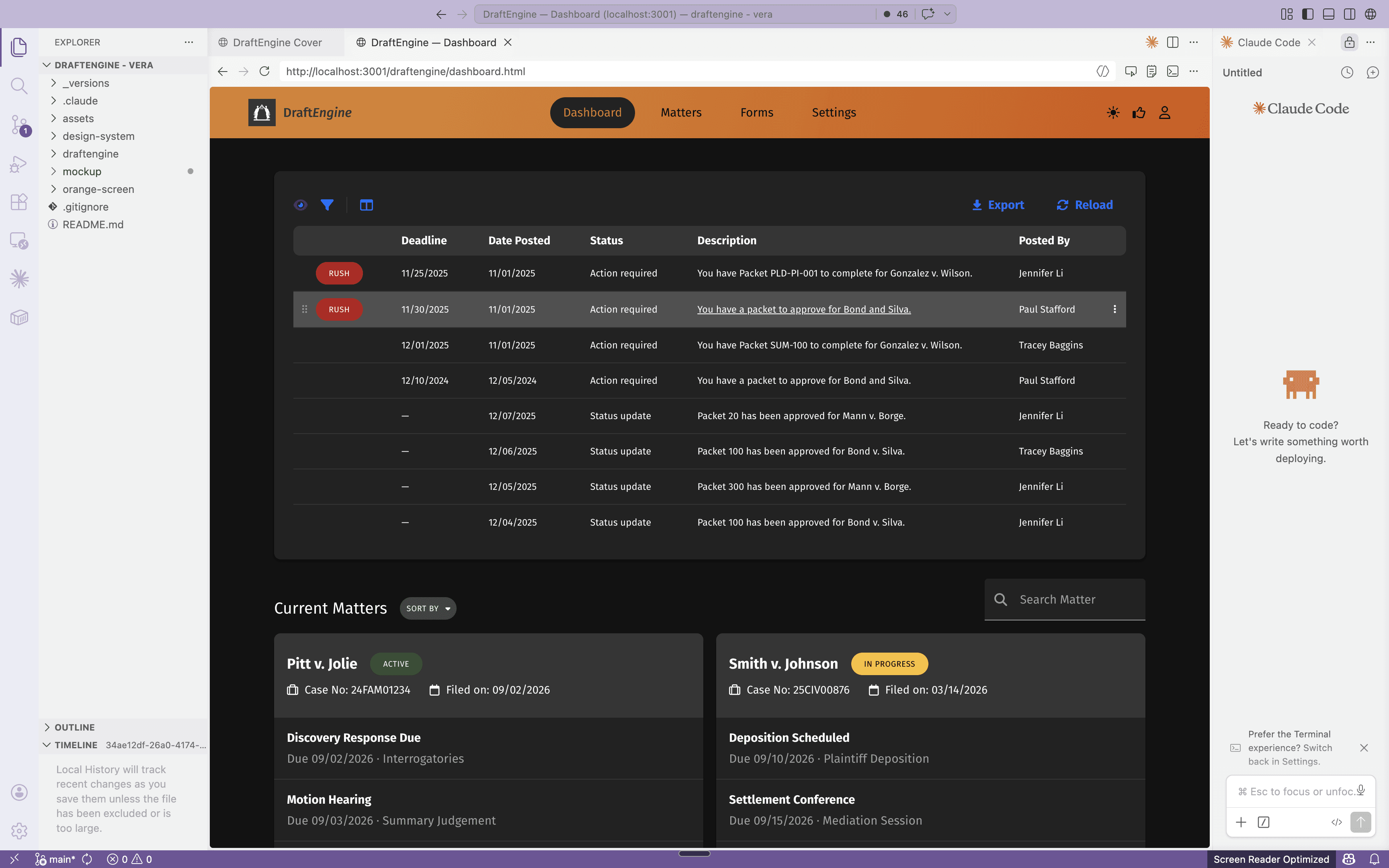
Streamlined the entire form-filling process by consolidating form completion, team management, and court interactions into a single platform, eliminating the need for manual emails and external websites.

Every matter, packet, and form page organized in one expandable grid — with status, deadlines, and quick actions always within reach.

Surfaced every case touchpoint — deadlines, team notes, in-progress and completed packets — in a single hub, with automatic highlighting for items due within seven days.

Court forms are automatically pulled and pre-filled with case data, so fields are always up to date and no one has to manually track changes or re-enter information.

Users can edit any field directly on the form and instantly see whether the data was pulled from the case management system or entered by hand so there is no guessing where information came from.

THE PROBLEM
Legal professionals spend hours manually filling court forms, leading to wasted time and errors.
USER RESEARCH
To solve this problem, I first conducted user research in several formats with legal professionals to deeply understand their workflows and identify key pain points.

CURRENT USER FLOW
At a high level, legal professionals are assigned cases, work through the required forms for each case, and submit completed forms to the court.
However, the current workflow is overly complex due to a fragmented platform. Filing a single matter meant juggling three or four tools—CMS, document editor, court portal, and more—with attorneys re-entering the same data at every handoff and no one owning the full picture. The real burden wasn't just the repetitive typing but the cognitive load of tracking what was current across systems.

DESIGN OPPORTUNITY
How might we let attorneys move faster from matter data to filed document without re-entering information or switching platforms?
NEW USER FLOW
The new workflow flipped the script. Firms already had the matter data in their CMS, so DraftEngine pulls it in once, applies it across every form in a packet, and produces filings. Same data, filled correctly, every time. This was the hypothesis we took into design.

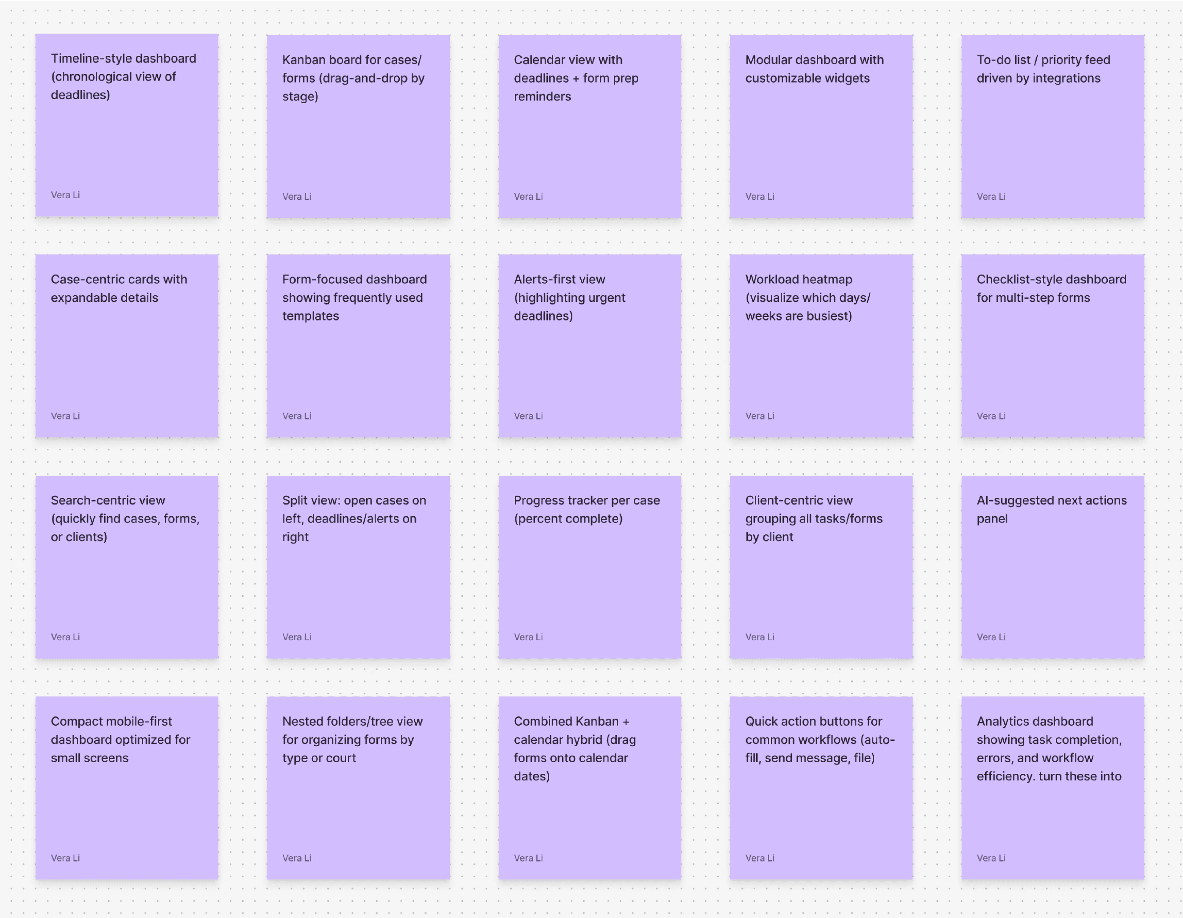
IDEATION
I explored a wide range of solutions to address the workflow challenges, then prioritized features based on user value and insights from competitive research.
FIRST VERSION
In the first design, attorneys land on a dashboard showing the day's priority tasks, then click into one to open a packet, a group of forms pre-assembled by the firm's paralegals. The review screen pairs all forms in the packet on the left with matter data pulled from the CMS on the right, letting attorneys scan, edit, and fill any gaps before approving the packet for filing.

FIRST USER TESTING RESULT
The number told two different stories.

While our platform made filling forms significantly faster, very few participants indicated they would actually adopt it. When I pushed further in follow-up conversations, the answer surfaced:
We solved speed. We haven’t solved trust.
DESIGN OPPORTUNITY REFRAMED
DESIGNING FOR TRUST

DESIGNING FOR TRUST AROUND ACCURACY
To design around accuracy, I made sure users were always working with the most current forms and gave pulled data a clear visual distinction from fields they entered themselves.

DESIGNING FOR TRUST AROUND COMPLETION
To design for completion, I surfaced urgent matters and forms prominently and flagged any missing fields so users could see at a glance what still needed attention.

DESIGNING FOR TRUST AROUND CONTROL
To design for control, I made sure automation added leverage rather than taking it away. Users can reorder forms in the left panel, customize the layout and revert back at any time, and lock specific fields so CMS updates won't overwrite their edits.

SECOND USER TESTING RESULT
After redesigning around trust, users filled out forms even faster thanks to clearer information organization, and every participant said they would adopt the platform because of its reliability.

TAKEAWAY
The problem might not be the problem.
Our brief was "make form-filling faster," but the real problem was trust. First-order briefs describe the pain; second-order research reveals the job.
Testing is a framing tool, not a validation tool.
Most teams use usability testing to confirm a design works. This project taught me it's better used to pressure-test whether the problem was framed correctly at all. Round 1 didn't tell me the buttons were wrong. It told me the problem statement was. The best testing shifts the question, not just the answer.
Name the framework so it travels.
Once we broke trust into three dimensions, the team had a shared vocabulary we reached for in every review that followed. Screens get redesigned, but frameworks stick.
·
DESIGN SYSTEM IN FIGMA
I established a modular design system in Figma from the ground up, leveraging variables and token architecture to enable long-term scalability. Throughout development, I collaborated with engineers to implement components accurately and maintain cross-platform consistency.
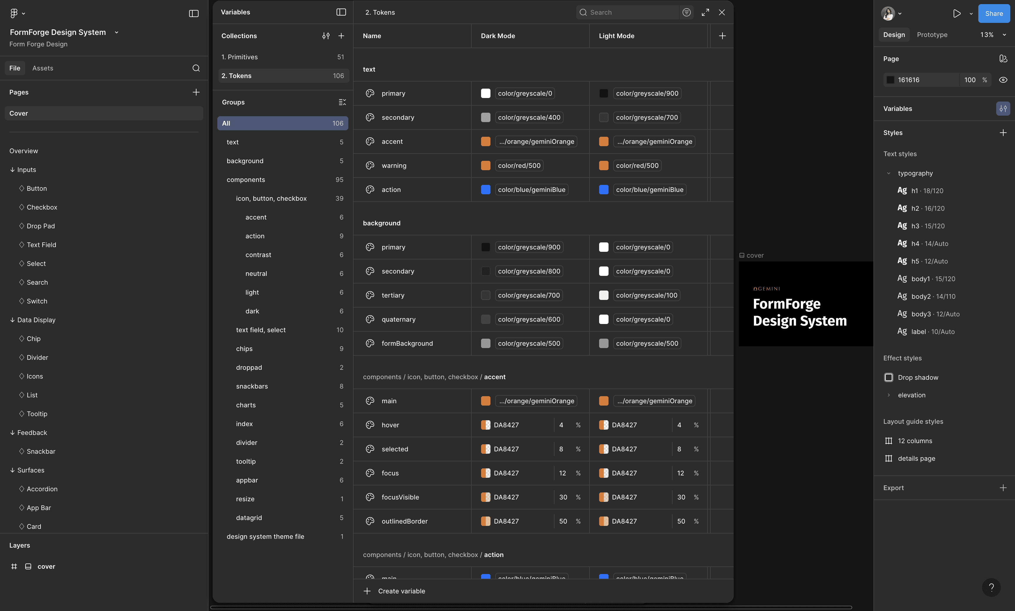
used Figma's variable modes to create themes systematically
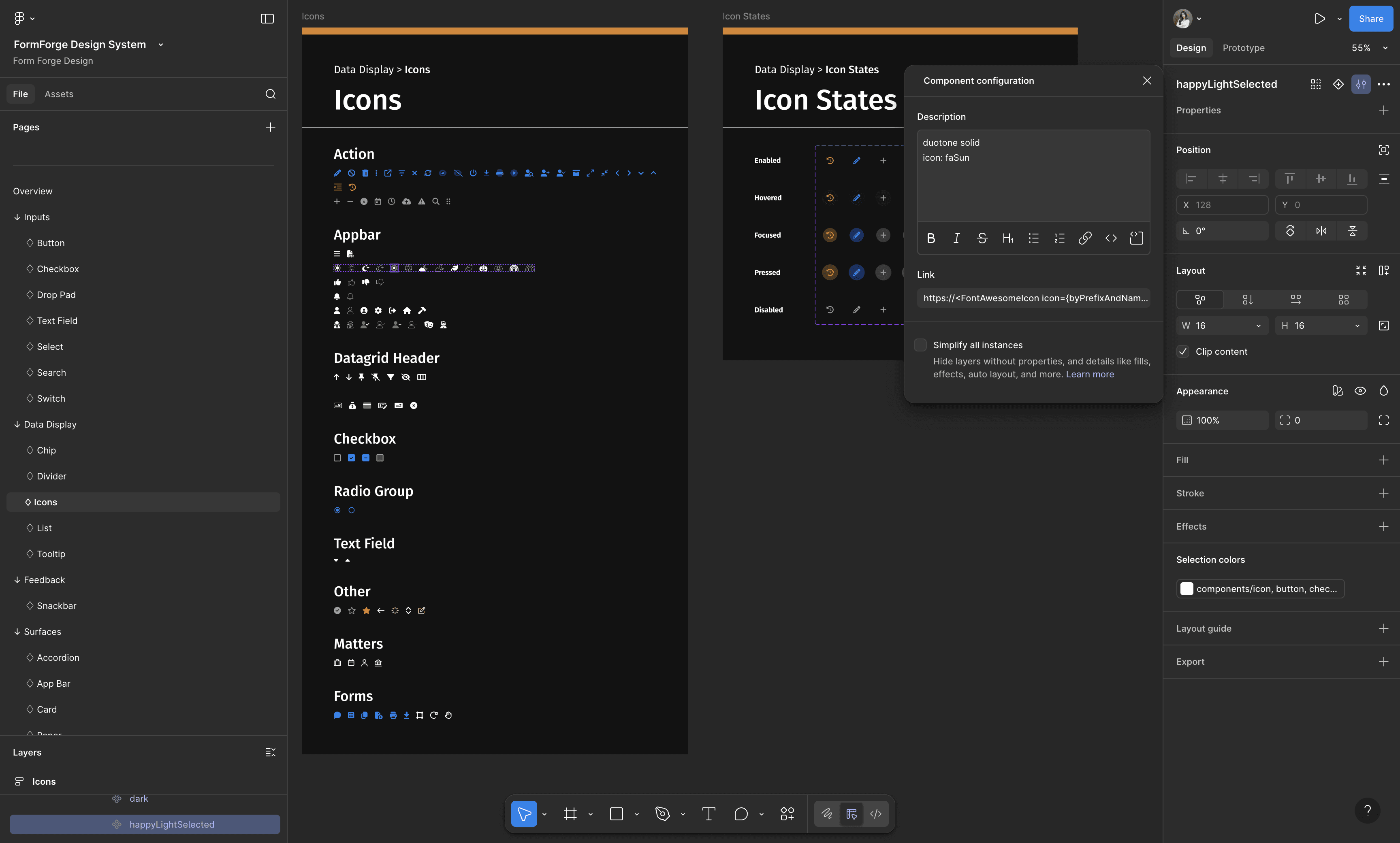
all icons map directly to their FontAwesome sources
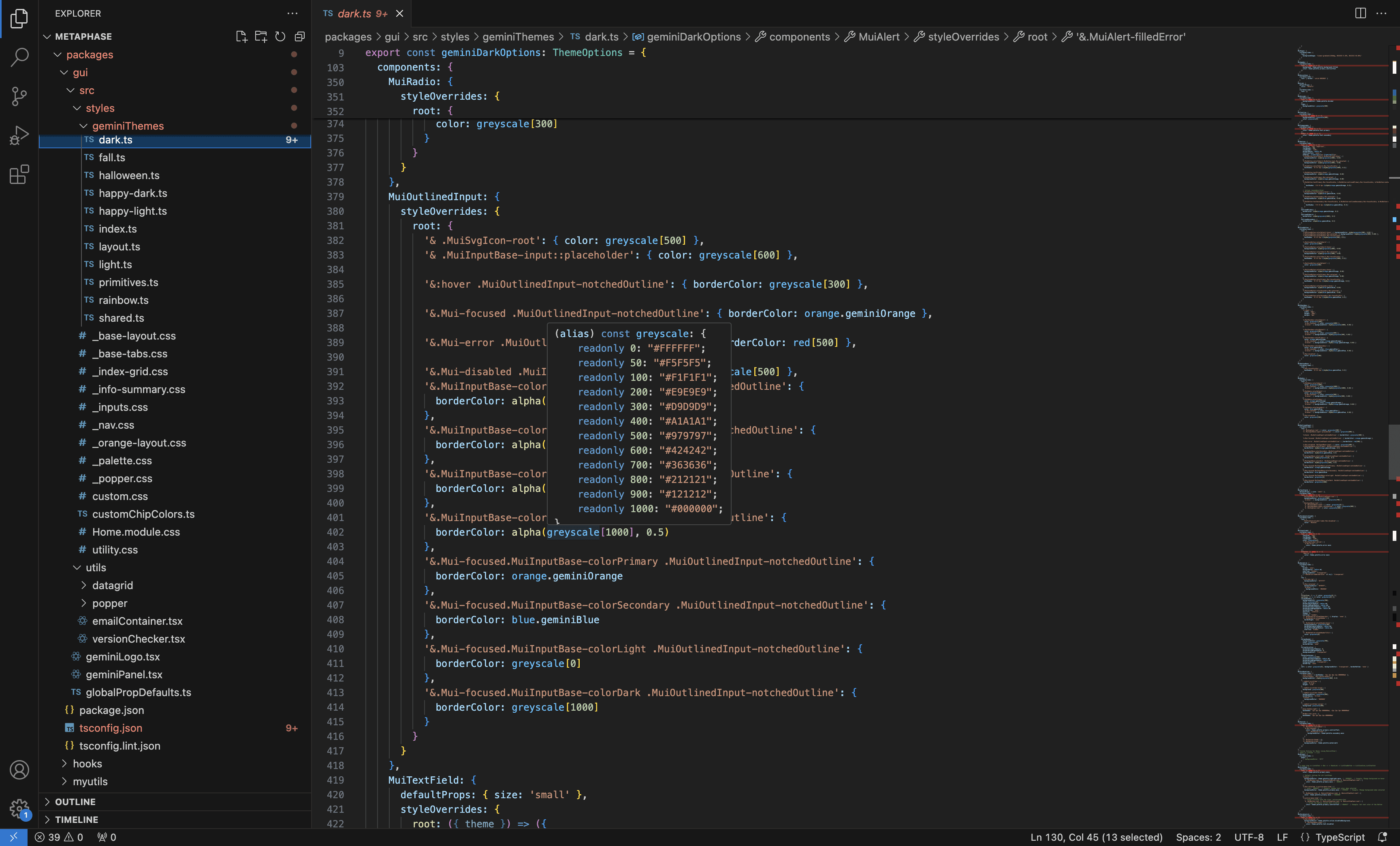
QA-ed the code base to make sure the naming and values are implemented correctly
AI PROTOTYPING IN CLAUDE
I then transferred the Figma assets into a design repo using Claude Code and set up the design system in Claude, enabling me to leverage Claude Code for AI prototyping. I started using it to rapidly prototype concepts to showcase to the team during my design process.

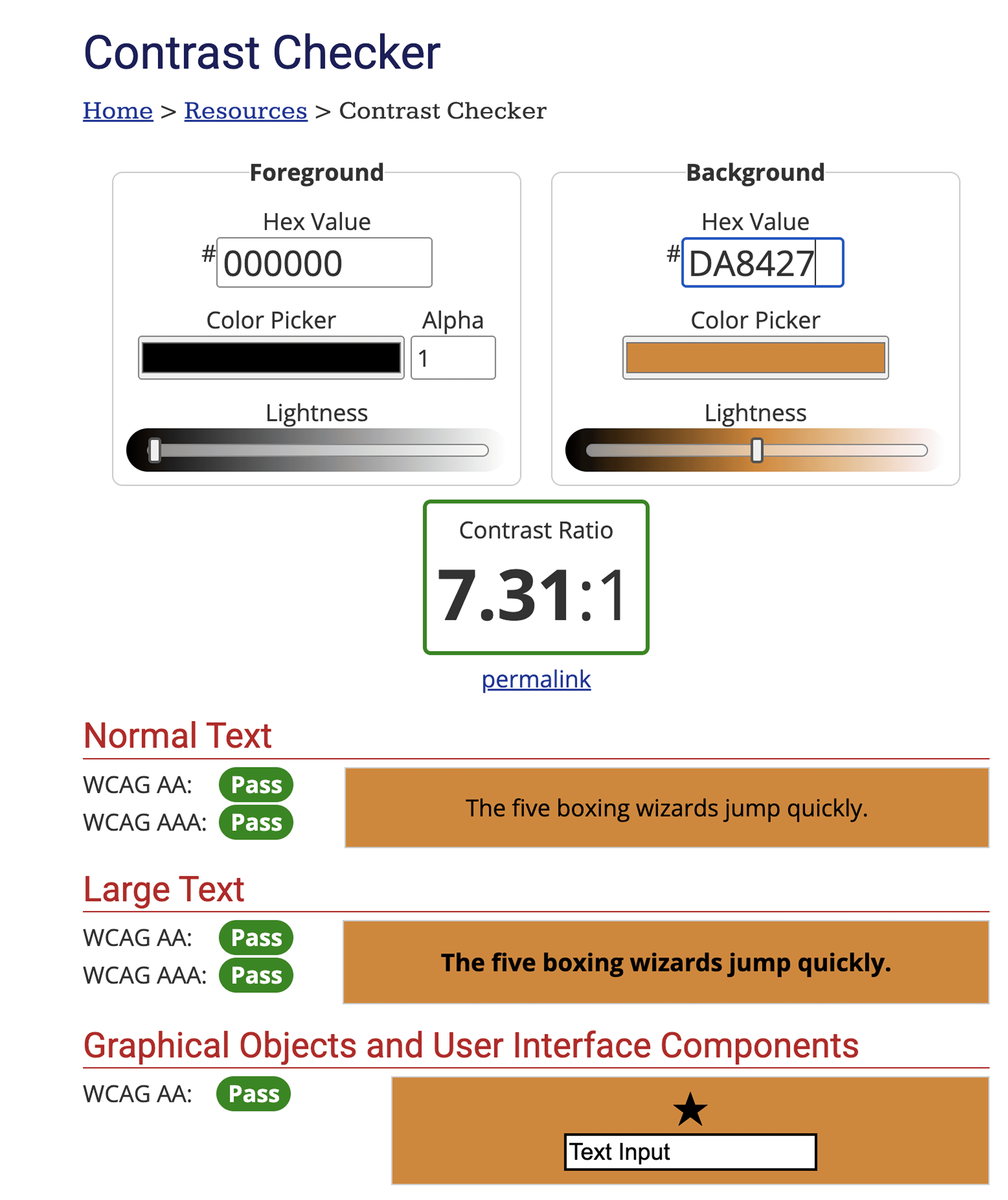
ACCESSIBILITY CHECK
I also ran multiple accessibility checks to ensure the design is inclusive, usable, and meets accessibility standards across various scenarios.